


Mastering the Charts: A Guide to Reading Crypto Data
Go beyond the numbers. Understand the tools and techniques used to analyze market trends and price movements through charts.
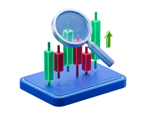
The Building Blocks of Crypto Charts
At its core, a cryptocurrency chart is a visual story of an asset's price over a set period. It tracks the battle between buyers and sellers, showing price movements in a way that raw numbers never could. The simplest form is the line chart, which connects a series of closing prices. This gives you a clean, immediate view of the general price trend, but it sacrifices detail for clarity. For a bit more information, analysts turn to bar charts, also known as OHLC charts. Each bar represents a single period (like a day or an hour) and shows four key data points: the open, high,low, and close. This richer dataset provides a more nuanced look at the volatility and price action within specific timeframes, laying the groundwork for more advanced analysis.
A chart is a visual database of market psychology. It shows fear, greed, and indecision at specific price levels, offering clues about potential future movements based on past behavior.

The Rise of the Candlestick Chart
While line and bar charts are functional, most modern analysts gravitate toward candlestick charts. They present the same OHLC data as bar charts but in a far more intuitive and visually compelling format. Each candle's shape and color make it easy to instantly see whether the price closed higher or lower than it opened. This visual immediacy is their greatest strength, as it helps the human eye detect recurring formations known as chart patterns much more efficiently. Formations like descending flags, double tops, or double bottoms become clearer on a candlestick chart. This is why they have become the industry standard. They serve as the primary canvas upon which other analytical tools, such as moving averages, are overlaid to build a more complete picture of the market.
- Highly visual and intuitive.
- Makes chart patterns easier to spot.
- Clearly shows market direction per period.
- Line charts can be overly simplistic.
- Bar charts are less intuitive than candles.
- Harder to quickly interpret market sentiment.
Decoding a Single Candlestick
To understand a candlestick chart, you must first understand its basic unit: the single candle. Each candle consists of two main parts. The wide part is the body, which represents the range between the open and close prices for that period. If the body is green (or white), the close was higher than the open. If it's red (or black), the close was lower. Extending from the top and bottom of the body are the wicks, also called shadows. The tip of the upper shadow marks the highest price reached during the period, and the bottom of the lower wick marks the lowest price. The relationship between the body and the wicks tells a story. A long body suggests strong buying or selling pressure, reflecting either bullish sentiment or bearish sentiment. A small body with long wicks, on the other hand, can indicate indecision in the market.
The body is the core of the candle. Its color indicates the price direction (up or down), and its size relative to the wicks suggests the strength of that movement.
Key One-Candle Signals
Certain individual candle shapes are so distinctive that they have been named and are watched closely by market analysts. These one-candle signals can provide a quick snapshot of market psychology. While many multi-candle patterns exist, understanding these single formations is a fundamental step. They don't predict the future, but they do articulate the current balance—or imbalance—between buyers and sellers. For example, some candles show a clear struggle that ends in a stalemate, while others might suggest a potential reversal after a strong trend. Learning to identify these signals is about learning to read the market's mood on a period-by-period basis, giving context to the larger price movements.
Common Single-Candle Patterns
A Doji has a very small body, indicating the open and close prices were nearly identical. It signals indecision and a potential turning point.
The Hammer candlestick pattern appears after a price decline. It has a small body at the top and a long lower wick, suggesting buyers stepped in to push prices up from their lows.
A Hanging Man looks like a Hammer but appears after a price advance. It suggests that sellers are beginning to challenge buyers' control, potentially signaling a top.
Essential Tools: An Introduction to Technical Indicators
Technical indicators are mathematical calculations based on an asset's price, volume, or other metrics. They are overlaid on or displayed below a chart to provide a different perspective on the price action. They are not magic signals but tools designed to help analysts understand concepts like market momentum, trend strength, and volatility. One of the most common is the Simple Moving Average (SMA), which smooths out price data to show the underlying trend direction more clearly. Another popular tool is the Relative Strength Index (RSI), an oscillator that measures the speed and change of price movements. It is often used to identify potentially overbought or oversold conditions in the market. Many analysts use a combination of indicators to look for confirmation before drawing any conclusions.
Shows the average price over a period to help identify trend direction.
Measures the magnitude of recent price changes to evaluate overbought or oversold conditions.
Shows the relationship between two moving averages to reveal changes in momentum.
Putting It All Together: A Framework for Analysis
Effective chart analysis involves combining these elements into a cohesive framework. It starts by identifying the broader market structure using trend lines, which connect consecutive highs or lows to visualize the current trajectory. Analysts also map out support and resistance levels—horizontal price zones where the market has historically pivoted. The goal is to find confluence, a scenario where multiple tools point to the same conclusion. For instance, a bullish candlestick pattern appearing at a known support level with a confirming RSI reading is often seen as a stronger signal than any one of those elements alone. Volume analysis is also a critical component; a price move accompanied by high volume is generally considered more significant than one with low volume. Finally, platforms like tradingview.com allow analysts to perform back-testing on historical data. This process is always grounded in strong risk management, as technical analysis is a game of probabilities, not certainties.
Frequently asked questions
-
What is the best type of chart for a crypto beginner to learn?
While line charts are the simplest for understanding general trends, candlestick charts are the most widely used and recommended for serious learning. Their visual nature provides more information about price action and market sentiment, which is fundamental to technical analysis. -
How reliable are candlestick patterns for predicting price movements?
Candlestick patterns are not foolproof predictors. They are historical patterns that reflect market psychology and suggest probabilities, not certainties. Their effectiveness can vary based on market conditions, the asset being analyzed, and the timeframe. They should be used as one component of a broader analytical strategy. -
Can I analyze crypto charts without using technical indicators?
Yes. This approach is often called 'price action' analysis. It focuses purely on reading the raw candlestick chart, identifying patterns, trend lines, and support and resistance levels without the use of lagging indicators like moving averages or RSI. Many analysts prefer this 'cleaner' approach. -
What's the difference between a logarithmic and a linear chart scale?
A linear (or arithmetic) scale shows price changes in equal increments, so a move from $10 to $20 looks the same as a move from $100 to $110. A logarithmic scale displays price changes in percentage terms, making it better for visualizing assets that have experienced massive price growth over long periods. -
Is technical analysis a guarantee of trading success?
Absolutely not. Technical analysis is a tool for managing probabilities and risk based on historical price data. It does not and cannot predict the future with certainty. Markets can be influenced by countless external factors, and no analytical method guarantees profit.
Crypto guides
Beginner-frendly
The Informational Guide to Trading Mechanics Understand the foundational concepts, systems, and structures that drive global financial markets
 Farouk Ahmed
|
Farouk Ahmed
|
Intraday Trading Mechanics Analyzing the technical execution, risk parameters, and software infrastructure behind daily market operations.
 Alexey Morozov
|
Alexey Morozov
|
How to Put Day Trading Profits Under an EIN An objective breakdown of transitioning from retail market participation to operating a structured commercial entity.
 Oliver Grant
|
Oliver Grant
|

Our website uses cookies. Our Cookie Policy